
Brand guidelines · Essentials
Version 1.0 · September 2026
Brand GuidelinesThe Essentials
Logo, colour and typography. Everything you need to use the vignetim. brand correctly.
Logo
Lockups & colour variants
Four approved lockups

Horizontal · symbol
Default. Web, documents, decks, email signatures.

Vertical · symbol
Square and portrait spaces, social media, roll-ups.

Horizontal · badge
In-app headers, app store visuals.

Vertical · badge
Splash screens, ad creatives.
Three colour versions
Teal / light background
White, Neutral 50, Teal 50.

White / teal background
Teal 500 to 800.
White / dark background
Neutral 800 to 900, over photography.
Also available
For single-colour print there is a single-colour dark version. Use this file instead of converting to greyscale.

Single-colour dark
- The wordmark is always lowercase, with the full stop: vignetim. Never capitalise the first letter or add letter-spacing.
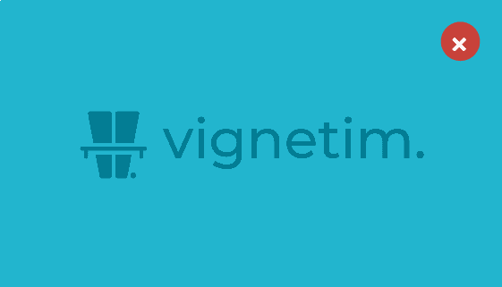
- Never place the teal badge on a teal background. It disappears. On teal, use the white symbol on its own.
- Use the symbol or badge on its own only when the brand name appears elsewhere on the same surface: app icon, favicon, profile picture.
- Never assemble lockups by hand. Always use the supplied file; never rearrange the parts.
Clear space & minimum size
Room to breathe, sizes that stay legible
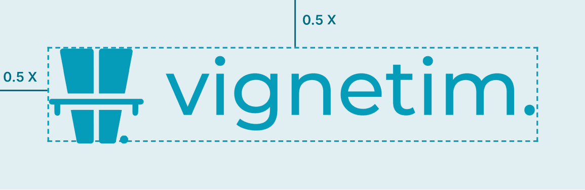
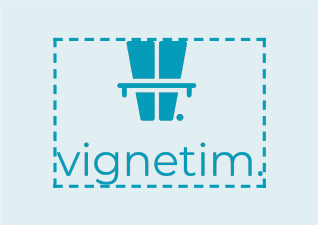
Leave at least 0.5 X of clear space on every side of the logo. X is the height of the symbol (or badge) in that lockup. No text, image, line, other logo or page edge may enter this area.

Minimum sizes
| Element | Digital | |
|---|---|---|
| Horizontal lockup · symbol | 140 px | 30 mm |
| Horizontal lockup · badge | 160 px | 34 mm |
| Vertical lockup · symbol | 72 px | 16 mm |
| Vertical lockup · badge | 80 px | 18 mm |
| Symbol (alone) | 20 px | 5 mm |
| Badge (alone) | 44 px | 8 mm |
Values are widths. Below these sizes, use the symbol or badge on its own instead of a lockup.
Two exceptions
- App icon: the clear-space rule does not apply. The badge fills the frame and the platform rounds the corners.
- Favicon (16 to 32 px): the badge becomes illegible; use the bare teal symbol on a transparent background.
Next to other logos
Keep at least 1 X between two logos, and balance them to the same optical height.
Colour
One brand colour, one neutral scale
The brand colour is Teal 500 · #049CB9. There is no secondary brand colour; depth comes from the shades of the teal scale and from neutral greys.
Vignetim teal
Neutrals
Technical values
- HEX
- #049CB9
- RGB
- 4 · 156 · 185
- CMYK (ref.)
- 98 · 16 · 0 · 27
- PANTONE (approx.)
- 313 C to 314 C
CMYK is a calculated reference; convert it with the printer's ICC profile.
Usage ratio
- White / Neutral 50
- Breathing space
- Neutral 600 to 900
- Text and structure
- Teal
- Accent and action
Each screen has exactly one primary action in teal.
Button states
Three contrast rules
- Teal 500 is not a text colour (3.25:1 on white). Use Teal 700 for text and links.
- White text on Teal 500 must be at least 18 px / 14 pt bold; for smaller text, use a Teal 700 background.
- In dark mode the accent is Teal 300 to 400; Teal 500 is not enough on dark backgrounds.
Typography
Inter, one typeface, four weights
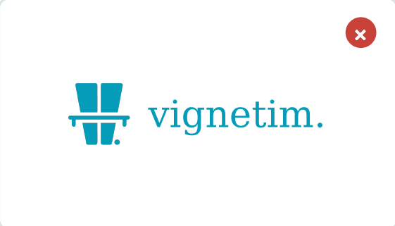
Inter is the brand's only typeface. Only the 400, 500, 600 and 700 weights are used. If Inter cannot be loaded, fall back to the system font, then Arial.
Aa Bb Cc Çç Ğğ Iı İi Şş Öö Üü 0123456789
Aa
Regular · 400
Body copy, long-form text.
Aa
Medium · 500
Labels, table headers, emphasis.
Aa
SemiBold · 600
Headings, buttons, overlines.
Aa
Bold · 700
Campaign headlines only.
H1 32 / 38 px · 600 · -0.020em
Your vignette, ready before the border
H2 24 / 30 px · 600 · -0.016em
How does a digital vignette work?
H3 20 / 26 px · 600 · -0.012em
Enter your vehicle's plate number
Body 16 / 26 px · 400
The app sends you a reminder when you are 30 km from the border.
Body S 14 / 22 px · 400
Prices are based on each country's official vignette tariff.
Overline 11 / 14 px · 600 · +0.11em · CAPS
Countries · Prices · FAQ
Line height: 1.10 to 1.25 for headings, 1.50 to 1.65 for body copy. Line length 60 to 75 characters. Always left-aligned.
- Don’t set body copy in capitals. Capitals are for overlines and short labels only.
- Don’t add letter-spacing to body copy, and don’t set it in teal.
- Don’t stretch or slant text; no faux italics or faux bold.
- Use no more than four levels on a single surface.
The Turkish capitals trap
In automatic conversion, “i” must become İ. Set lang="tr" in HTML and use toLocaleUpperCase('tr') in code. Otherwise “istanbul” becomes “ISTANBUL”.
The reverse also applies: English text needs lang="en", or “Size” turns into “SİZE”.
Languages: latin-ext subsets for TR and RO, cyrillic for UA, latin for DE and EN. All are part of Inter. Never switch typeface for a different language.
Misuse
What never to do with the logo
This list is not exhaustive: altering the logo in any way other than the supplied file counts as misuse.
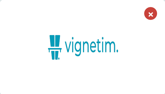
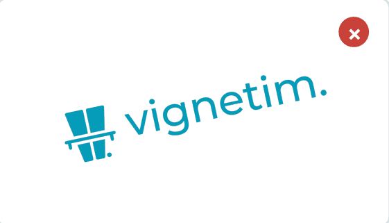


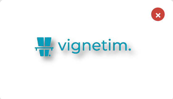




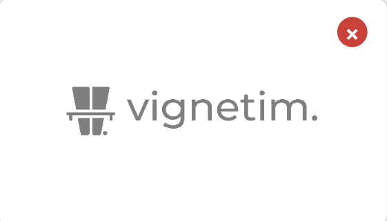
When single-colour print is required, use the approved single-colour dark version, not greyscale.
Quick reference
The whole guide at a glance
Colour card
- Teal 500 · brand#049CB9
- Teal 700 · text / links#046B80
- Teal 300 · dark-mode accent#5FCEE2
- Neutral 900 · headings#161B1E
- Neutral 600 · secondary text#565E64
- Neutral 50 · surface#F7F8F9
Five rules
- Use the logo from the supplied file.
- Leave 0.5 X clear space on every side.
- Teal 500 is not a text colour. Use Teal 700.
- One typeface: Inter, 400 / 500 / 600 / 700.
- No more than 10% of any surface is teal.
File list
- All logosZIP
- vignetim-horizontal-tealPNG
- vignetim-horizontal-whitePNG
- vignetim-horizontal-single-colour-darkPNG
- vignetim-vertical-tealPNG
- vignetim-badge-horizontalPNG
- vignetim-badge-verticalPNG
- vignetim-badgePNG
- vignetim-symbol-teal / whiteOn request
- vignetim-appicon-1024On request
- vignetim-favicon-16/32/48On request
For print and large-format use, request the vector (SVG or EPS) files. PNG only where vectors are not supported.
App icon
- App Store (iOS)
- 1024 × 1024 px, no transparency
- Google Play
- 512 × 512 px, 32-bit PNG
- Play · feature graphic
- 1024 × 500 px
- Social profile
- 1000 × 1000 px
Upload a full-bleed square with no rounded corners. The operating system rounds them.
CSS variables
:root {
  --brand-500: #049CB9;
  --brand-600: #03849E;
  --brand-700: #046B80;
  --brand-300: #5FCEE2;
  --brand-50: #EAF8FB;
  --ink-900: #161B1E;
  --ink-600: #565E64;
  --ink-200: #DDE1E4;
  --ink-50: #F7F8F9;
  --font-sans: Inter, -apple-system, "Segoe UI", Roboto, Arial, sans-serif;
}
Questions & approvals
For any use not covered in this guide, or to request a new asset, contact the brand owner.
Version 1.0 · September 2026